Outlier Detection in Embedding Vector Trajectories
Authors: Petr Khrapchenkov Organization: AI Robot Association (AIRoA)
| Model | Workload | Use Case |
|---|---|---|
| Cosmos Curator | Data Curation | Outlier detection in video embedding trajectories via Time Series K-Means + Soft-DTW distance thresholding |
Overview
This recipe follows up from the embedding analysis / trajectory clustering recipe by showing how we can do outlier detection.
You will:
- Download and load sample data
- Rebuild the clustering from the previous step
- Identify and quantify anomalous videos in a dataset
- Visualize the results
Motivation
Once a team has adopted Cosmos Curator, a common use case is to classify clips into different groupings, often for training on specific tasks or scenarios. With the method explained here, you will be able to further classify videos based on how typical they are within their grouping. This new information can be used for selective manual review, or for special selection depending on interest in having more typical videos or more exceptional ones within any given task.
Approach
This recipe builds on the previous one, where we employ a similar clustering technique described in the embedding analysis / trajectory clustering recipe. Here we extend it with outlier detection and visualization. At AIRoA, we have been using this technique to further understand and refine our training data, and reveal opportunities to improve our processes.
The Core Idea
We follow the steps from the embedding analysis / trajectory clustering recipe like before (repeated in this cookbook for simplicity), giving us interpolated trajectories of consistent length, then reduced dimensionality using PCA (as compared to UMAP in the previous recipe), and finally using Time Series K-Means to cluster the resulting trajectories. This gives us trajectories for each video, along with the cluster it is a part of, and the barycenter of its cluster. We can then compare the trajectory against that barycenter to determine if it is an inlier or an outlier, by flagging those whose distance from the barycenter exceeds a tunable threshold. With this information we can visualize the trajectories, mark the inliers and outliers on a scatterplot, rank outliers by severity, and show how anomalous each video is within its cluster.
Files
The sample JSON file above contains embeddings from the public HSR Household Service Robot Teleoperation Dataset, created with the Cosmos-Embed1-336p model.
The instructions below were tested with the following uv + jupyter notebook setup:
Recipe Steps
- Load raw embedding trajectories
- Interpolate trajectories to a fixed length
- Configure parameters
- Reduce dimensionality with PCA
- Run Time Series K-Means clustering
- Identify outliers
- Visualize clusters
- Visualize outliers
- Inspect distance distributions and outlier details
Performing the analysis
1 - Load raw embedding trajectories
We start by loading your data, or in this case, the included sample data, which represents embedding trajectories for individual video clips. See the previous recipe for a deeper explanation.
import json
import numpy as np

trajectories_raw = json.load(open("outlier_analysis_trajectories.json", "r"))
2 - Interpolate trajectories to a fixed length
Depending on your data, the lengths of each trajectory may vary, so we can interpolate them to a common length, as we did in the previous recipe.
def subdivide_trajectory(trajectory: np.ndarray, n_points: int) -> np.ndarray:
    traj = np.asarray(trajectory, dtype=float)
    t_len, n_features = traj.shape
    if t_len == 1:
        return np.repeat(traj, repeats=n_points, axis=0)

    x_old = np.linspace(0.0, 1.0, t_len)
    x_new = np.linspace(0.0, 1.0, n_points)

    out = np.empty((n_points, n_features), dtype=float)
    for feat_idx in range(n_features):
        out[:, feat_idx] = np.interp(x_new, x_old, traj[:, feat_idx])
    return out

interpolated = np.asarray(
    [subdivide_trajectory(np.asarray(t), 20) for t in trajectories_raw]
)
n_traj, t_len, dim = interpolated.shape
3 - Configure parameters
These two parameters will be used in the subsequent sections, and depending on your data may need to be tuned. These values should be fine for the referenced sample data.
# ── Parameters ─────────────────────────────────────────────---
N_COMPONENTS = 3 # Number of PCA dimensions
N_CLUSTERS = 6 # Number of Time Series K-Means clusters

# -- Random Seed --─────────────────────────────────────────────
RANDOM_SEED = 1234
4 - Reduce dimensionality with PCA
The trajectories provided are very high-dimensional vectors, which we reduce using PCA to the 3 dimensions specified in the prior configuration step. This is a divergence from the UMAP approach used in the previous recipe. Both UMAP and PCA are valid approaches to this. In this case PCA is faster, deterministic, and provides sufficient quality for our purposes. Experimentation and comparison are left as an exercise to the reader.
# ── Dimension reduction (PCA) ────────────────────────────────
from sklearn.decomposition import PCA

flat = interpolated.reshape(n_traj * t_len, dim)

pca = PCA(n_components=N_COMPONENTS, random_state=RANDOM_SEED)
flat_reduced = pca.fit_transform(flat)

trajectories_reduced = flat_reduced.reshape(n_traj, t_len, N_COMPONENTS)

explained = pca.explained_variance_ratio_
print(f"Reduced to {N_COMPONENTS}D via PCA")
for i, v in enumerate(explained):
    print(f"  PC{i+1}: {v*100:.2f}%")
print(f"  Total explained variance: {explained.sum()*100:.2f}%")
5 - Run Time Series K-Means clustering
Like the previous recipe, we use Time Series K-Means with Soft-DTW to compute clusters and barycenters. We then compute the distances between each trajectory and its barycenter using the soft_dtw metric. These distances will be useful in identifying outliers in the next step.
# ── Time Series K-Means clustering ───────────────────────────

from tslearn.clustering import TimeSeriesKMeans
from tslearn.metrics import soft_dtw

TS_METRIC = "softdtw"

model = TimeSeriesKMeans(
    n_clusters=N_CLUSTERS,
    metric=TS_METRIC,
    max_iter=50,
    random_state=RANDOM_SEED,
    verbose=False,
)
print("Fitting model... (may take about 5 minutes depending on data)")
traj_labels = model.fit_predict(trajectories_reduced)
print(f"Traj labels: {traj_labels.shape}")
centers = np.asarray(model.cluster_centers_)
print(f"Centers: {centers.shape}")
print(f"Clusters: {N_CLUSTERS} | Metric: {TS_METRIC}")
for cid in range(N_CLUSTERS):
    count = int((traj_labels == cid).sum())
    print(f"  Cluster {cid}: {count} trajectories ({100*count/n_traj:.1f}%)")

distances = np.zeros(n_traj)
for i in range(n_traj):
    cid = traj_labels[i]
    distances[i] = soft_dtw(trajectories_reduced[i], centers[cid], gamma=1.0)
6 - Identify outliers
Here we use the distance computed above to identify which are outliers based on which are farthest from their cluster's barycenter. We can find the 95% quantile distance across all clusters (95% as a default, tunable to your use cases and data), and then label all trajectories which are farther from the barycenter than this threshold as outliers.
We can then look at each cluster to see which has more or fewer outliers. Based on the semantic meaning of each cluster (specific robotic actions in the case of our test data), we can better understand which parts of our data have more variance.
# ── Outlier detection ────────────────────────────────────────

QUANTILE_THRESHOLD = 0.95

global_threshold = float(np.quantile(distances, QUANTILE_THRESHOLD))
is_outlier = distances > global_threshold

n_outliers = int(is_outlier.sum())
n_total = n_traj
print(f"Outlier threshold (Q{int(QUANTILE_THRESHOLD*100)}): {global_threshold:.3f}")
print(f"Outliers: {n_outliers}/{n_total} ({100*n_outliers/n_total:.1f}%)")

print("\nPer-cluster outlier summary:")
for cid in range(N_CLUSTERS):
    mask = traj_labels == cid
    c_total = int(mask.sum())
    c_outliers = int((mask & is_outlier).sum())
    print(f"  Cluster {cid}: {c_outliers}/{c_total} outliers ({100*c_outliers/c_total:.1f}%)")
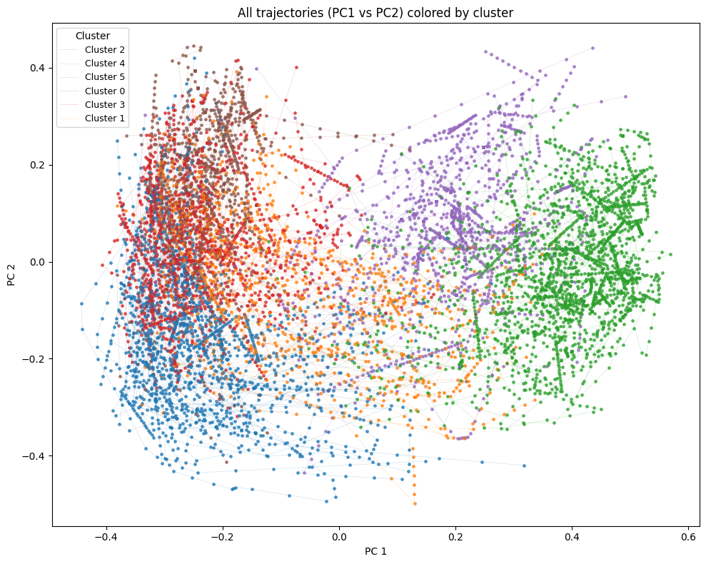
7 - Visualize clusters
Now we can start to visualize the data. We will start by just showing the trajectories, color-coded per cluster, so we can see the data further reduced to the first two principal components.
# ── Trajectory cluster visualization ────────

import matplotlib.pyplot as plt

cmap = plt.get_cmap("tab10")
color_map = {cid: cmap(cid % cmap.N) for cid in range(N_CLUSTERS)}

plt.figure(figsize=(10, 8))
labeled = set()
for i in range(n_traj):
    cid = int(traj_labels[i])
    label = f"Cluster {cid}" if cid not in labeled else None
    labeled.add(cid)
    plt.plot(trajectories_reduced[i, :, 0], trajectories_reduced[i, :, 1],
             linewidth=0.5, alpha=0.20, color=color_map[cid], label=label)
    plt.scatter(trajectories_reduced[i, :, 0], trajectories_reduced[i, :, 1],
                s=6, alpha=0.7, color=color_map[cid])
plt.title("All trajectories (PC1 vs PC2) colored by cluster")
plt.xlabel("PC 1")
plt.ylabel("PC 2")
plt.legend(title="Cluster", loc="best", markerscale=2, fontsize=9)
plt.tight_layout()
plt.show()
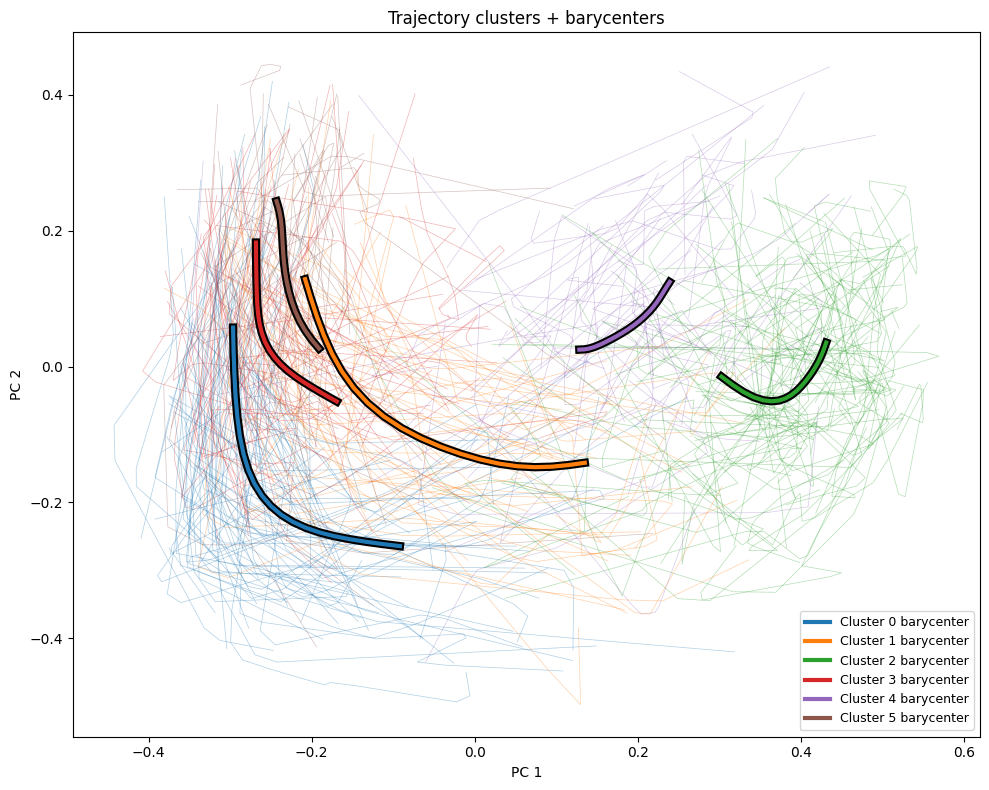
More interesting is how we can compare the overall trajectories to the barycenters for each cluster, which we graph here as bold lines on top of the rest of the trajectories.
# ── Trajectory cluster visualization with barycenters ────────
plt.figure(figsize=(10, 8))
for i in range(n_traj):
    cid = int(traj_labels[i])
    plt.plot(trajectories_reduced[i, :, 0], trajectories_reduced[i, :, 1],
             linewidth=0.5, alpha=0.35, color=color_map[cid])
for cid in range(N_CLUSTERS):
    plt.plot(centers[cid, :, 0], centers[cid, :, 1],
             linewidth=6.0, alpha=1.0, color="black", zorder=10)
    plt.plot(centers[cid, :, 0], centers[cid, :, 1],
             linewidth=3.0, alpha=1.0, color=color_map[cid],
             label=f"Cluster {cid} barycenter", zorder=11)
plt.title("Trajectory clusters + barycenters")
plt.xlabel("PC 1")
plt.ylabel("PC 2")
plt.legend(loc="best", fontsize=9)
plt.tight_layout()
plt.show()
8 - Visualize outliers
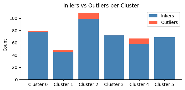
We previously noted that we determined the outlier threshold across all clusters, but this means each cluster may have a different proportion of outliers. We can visualize this here with a bar chart which shows the proportion of outliers in each cluster.
# ── Outlier visualizations ───────────────────────────────────

# Bar chart: inliers vs outliers per cluster
cluster_ids = list(range(N_CLUSTERS))
inlier_counts = []
outlier_counts = []
for cid in cluster_ids:
    mask = traj_labels == cid
    outlier_counts.append(int((mask & is_outlier).sum()))
    inlier_counts.append(int((mask & ~is_outlier).sum()))

x = np.arange(N_CLUSTERS)
fig_bar, ax = plt.subplots(figsize=(6, 3))
ax.bar(x, inlier_counts, label="Inliers", color="steelblue")
ax.bar(x, outlier_counts, bottom=inlier_counts, label="Outliers", color="tomato")
ax.set_xticks(x)
ax.set_xticklabels([f"Cluster {c}" for c in cluster_ids])
ax.set_ylabel("Count")
ax.set_title("Inliers vs Outliers per Cluster")
ax.legend()
plt.tight_layout()
plt.show()
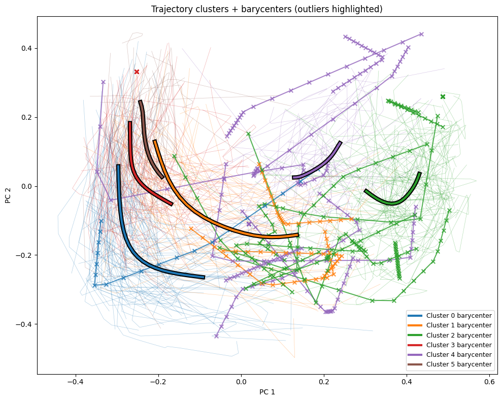
And we can further put the data back in the spatial context, to see which trajectories are considered outliers, indicated highlighted trajectories with "x"s, compared to the faint inliers.
# ── Trajectory with barycenters, outliers highlighted ────────

plt.figure(figsize=(10, 8))

# Inlier trajectories: thin, low alpha
for i in range(n_traj):
    if is_outlier[i]:
        continue
    cid = int(traj_labels[i])
    plt.plot(trajectories_reduced[i, :, 0], trajectories_reduced[i, :, 1],
             linewidth=0.5, alpha=0.35, color=color_map[cid])

# Outlier trajectories: thicker, high alpha, with point markers
for i in range(n_traj):
    if not is_outlier[i]:
        continue
    cid = int(traj_labels[i])
    plt.plot(trajectories_reduced[i, :, 0], trajectories_reduced[i, :, 1],
             linewidth=1.5, alpha=0.8, color=color_map[cid], zorder=8)
    plt.scatter(trajectories_reduced[i, :, 0], trajectories_reduced[i, :, 1],
                s=30, marker="x", color=color_map[cid], alpha=0.8, zorder=9)

# Barycenters: bold lines on top
for cid in range(N_CLUSTERS):
    plt.plot(centers[cid, :, 0], centers[cid, :, 1],
             linewidth=6.0, alpha=1.0, color="black", zorder=10)
    plt.plot(centers[cid, :, 0], centers[cid, :, 1],
             linewidth=3.0, alpha=1.0, color=color_map[cid],
             label=f"Cluster {cid} barycenter", zorder=11)

plt.title("Trajectory clusters + barycenters (outliers highlighted)")
plt.xlabel("PC 1")
plt.ylabel("PC 2")
plt.legend(loc="best", fontsize=9)
plt.tight_layout()
plt.show()
9 - Inspect distance distributions and outlier details
We can wrap up our analysis with one last set of histograms and two tables.
Here we will build a histogram of each cluster, showing the distribution of distances within each cluster, compared against the global quantile threshold.
# ── Distance distribution & statistics ───────────────────────

# Per-cluster distance histograms
n_cols = min(3, N_CLUSTERS)
n_rows = (N_CLUSTERS + n_cols - 1) // n_cols
fig_hist, axes = plt.subplots(n_rows, n_cols, figsize=(5 * n_cols, 4 * n_rows), squeeze=False)

for idx, cid in enumerate(range(N_CLUSTERS)):
    row, col = divmod(idx, n_cols)
    ax = axes[row][col]

    mask = traj_labels == cid
    cluster_distances = distances[mask]
    mean_dist = float(np.mean(cluster_distances))

    ax.hist(cluster_distances, bins=30, color=color_map[cid], alpha=0.7, edgecolor="white")
    ax.axvline(global_threshold, color="red", linewidth=2, linestyle="--",
               label=f"Global Q{int(QUANTILE_THRESHOLD*100)}: {global_threshold:.2f}")
    ax.axvline(mean_dist, color="green", linewidth=1, linestyle=":",
               label=f"Mean: {mean_dist:.2f}")
    ax.set_title(f"Cluster {cid} ({int(mask.sum())} trajectories)")
    ax.set_xlabel("Distance to barycenter")
    ax.set_ylabel("Frequency")
    ax.legend(fontsize=7)

for idx in range(N_CLUSTERS, n_rows * n_cols):
    row, col = divmod(idx, n_cols)
    axes[row][col].set_visible(False)

plt.suptitle("Distance Distribution by Cluster", fontsize=14)
plt.tight_layout()
plt.show()
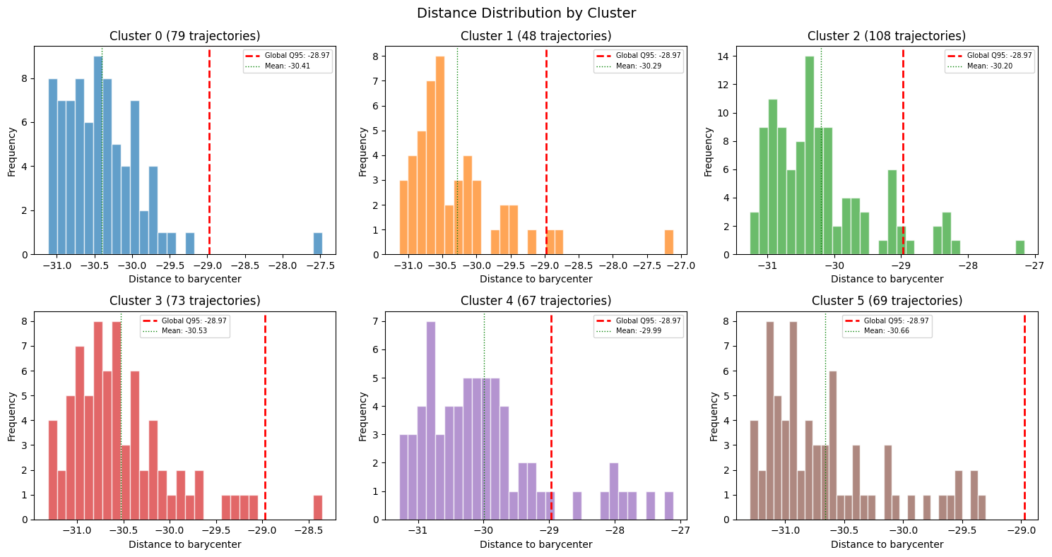
We can continue this per-cluster analysis by showing the same distance statistics in tabular form.
# Distance statistics summary
print("Distance statistics per cluster:")
print(f"{'Cluster':>8} {'Size':>6} {'Mean':>8} {'Std':>8} {'Min':>8} {'Max':>8} {'Q50':>8} {'Q95':>8}")
print("-" * 70)
for cid in range(N_CLUSTERS):
    mask = traj_labels == cid
    d = distances[mask]
    print(f"{cid:>8} {int(mask.sum()):>6} {np.mean(d):>8.3f} {np.std(d):>8.3f} "
          f"{np.min(d):>8.3f} {np.max(d):>8.3f} {np.median(d):>8.3f} {np.quantile(d, 0.95):>8.3f}")

print(f"{'GLOBAL':>8} {n_traj:>6} {np.mean(distances):>8.3f} {np.std(distances):>8.3f} "
      f"{np.min(distances):>8.3f} {np.max(distances):>8.3f} {np.median(distances):>8.3f} "
      f"{np.quantile(distances, 0.95):>8.3f}")
Distance statistics per cluster:
 Cluster   Size     Mean      Std      Min      Max      Q50      Q95
----------------------------------------------------------------------
       0     72  -30.302    0.627  -31.215  -27.931  -30.478  -28.961
       1    111  -30.134    0.839  -31.253  -27.137  -30.356  -28.452
       2     76  -30.587    0.463  -31.283  -28.922  -30.685  -29.801
       3     62  -30.466    0.508  -31.122  -27.928  -30.550  -29.843
       4     55  -30.732    0.526  -31.221  -28.705  -30.908  -29.735
       5     68  -29.977    0.964  -31.289  -27.070  -30.164  -27.888
  GLOBAL    444  -30.335    0.743  -31.289  -27.070  -30.507  -28.710
Finally, we can identify each individual outlier. We can create a table which shows every outlier, starting with the worst outlier, along with its distance, percentile rank, and cluster context.
# Outlier details table
from scipy.stats import percentileofscore

outlier_indices = np.where(is_outlier)[0]
outlier_indices = outlier_indices[np.argsort(distances[outlier_indices])[::-1]]

print(f"\n{len(outlier_indices)} outlier trajectories (sorted by distance descending):")
print(f"{'idx':>5} {'traj_id':>8} {'cluster':>8} {'distance':>10} {'dist_pctl':>10} "
      f"{'threshold':>10} {'outlier':>8} {'cl_size':>8} {'cl_mean':>10} {'cl_std':>10}")
print("-" * 98)
for rank, i in enumerate(outlier_indices):
    cid = int(traj_labels[i])
    cluster_mask = traj_labels == cid
    cluster_dists = distances[cluster_mask]
    pctl = percentileofscore(distances, distances[i]) / 100.0
    print(f"{rank:>5} {i:>8} {cid:>8} {distances[i]:>10.3f} {pctl:>10.4f} "
          f"{global_threshold:>10.3f} {'True':>8} {int(cluster_mask.sum()):>8} "
          f"{np.mean(cluster_dists):>10.3f} {np.std(cluster_dists):>10.3f}")
23 outlier trajectories (sorted by distance descending):
  idx  traj_id  cluster   distance  dist_pctl  threshold  outlier  cl_size    cl_mean     cl_std
--------------------------------------------------------------------------------------------------
    0      318        5    -27.070     1.0000    -28.710     True       68    -29.977      0.964
    1      319        1    -27.137     0.9977    -28.710     True      111    -30.134      0.839
    2      186        1    -27.258     0.9955    -28.710     True      111    -30.134      0.839
    3      241        5    -27.468     0.9932    -28.710     True       68    -29.977      0.964
    4      110        5    -27.751     0.9910    -28.710     True       68    -29.977      0.964
    5      204        5    -27.870     0.9887    -28.710     True       68    -29.977      0.964
    6      172        5    -27.922     0.9865    -28.710     True       68    -29.977      0.964
    7      253        3    -27.928     0.9842    -28.710     True       62    -30.466      0.508
    8      408        0    -27.931     0.9820    -28.710     True       72    -30.302      0.627
    9      435        5    -28.018     0.9797    -28.710     True       68    -29.977      0.964
   10      269        1    -28.082     0.9775    -28.710     True      111    -30.134      0.839
   11      102        1    -28.124     0.9752    -28.710     True      111    -30.134      0.839
   12      207        5    -28.147     0.9730    -28.710     True       68    -29.977      0.964
   13      161        1    -28.370     0.9707    -28.710     True      111    -30.134      0.839
   14      183        1    -28.444     0.9685    -28.710     True      111    -30.134      0.839
   15       96        1    -28.460     0.9662    -28.710     True      111    -30.134      0.839
   16      337        1    -28.465     0.9640    -28.710     True      111    -30.134      0.839
   17      352        1    -28.505     0.9617    -28.710     True      111    -30.134      0.839
   18      409        0    -28.541     0.9595    -28.710     True       72    -30.302      0.627
   19      421        0    -28.612     0.9572    -28.710     True       72    -30.302      0.627
   20      364        5    -28.642     0.9550    -28.710     True       68    -29.977      0.964
   21      416        0    -28.672     0.9527    -28.710     True       72    -30.302      0.627
   22       70        4    -28.705     0.9505    -28.710     True       55    -30.732      0.526
In this table, each row is a reference back to our original video clips. From here we can now take direct action on each clip, such as removing them from our training pool, flagging them for human review, or even putting them up for consideration as interesting cases not handled by our solutions.
Document Information
Publication Date: March 15, 2026
Citation
If you use this recipe or reference this work, please cite it as:
@misc{cosmos_cookbook_dataset_outlier_detection_2026,
  title={Outlier Detection in Embedding Vector Trajectories},
  author={Khrapchenkov, Petr},
  organization={AI Robot Association (AIRoA)},
  year={2026},
  month={March},
  howpublished={\url{https://nvidia-cosmos.github.io/cosmos-cookbook/recipes/data_curation/outlier_detection/outlier_detection.html}},
  note={NVIDIA Cosmos Cookbook}
}
Suggested text citation:
Petr Khrapchenkov (2026). Outlier Detection in Embedding Vector Trajectories. In NVIDIA Cosmos Cookbook. AI Robot Association (AIRoA). Accessible at https://nvidia-cosmos.github.io/cosmos-cookbook/recipes/data_curation/outlier_detection/outlier_detection.html